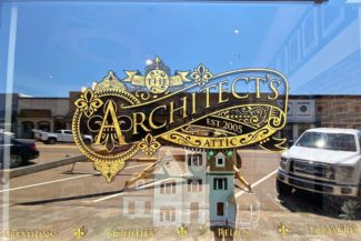
Classic Gold Foil
Logo & Window Graphics
So shiny!
Architect’s Attic was in need of a new logo and storefront branding and they had an idea of what they wanted – they just needed someone to bring it to life. Similar to storefronts of old where paint and gold foil were used with lettering and flourishes – they wanted their logo to have a classic antique look.
They also needed two logos – one for the store Architect’s Attic, and one for D. Tracey Ward, the architect. They also wanted them to look similar to each other, but different upon close inspection.
In the end their two storefront windows each received a large gold foiled version of their new logos and they couldn’t be happier with them. If you’re ever in Flora, MS be sure to swing by and check them out or visit them on Facebook.


